

SHOWCASE
/ ARTIST / 2026
| ARTIST: | Sudena Chandnani |
| COUNTRY: | India |
| CONTACT: |
https://sudenaswork.vercel.app/ https://www.instagram.com/_sudena_?igsh=MTNvNWFpZ2o5a2VyZQ%3D%3D www.linkedin.com/in/sudena-chandnani |
| I'm a passionate designer with a keen eye for detail and a love for creating meaningful work. What began as a confusion between marketing and design soon became a fascination leading me to explore how ideas connect, communicate, and influence. My curiosity about how things work, paired with a research-driven mindset, has shaped a career focused on solving problems through thoughtful design. A Communication Design student with a passion for narrative-driven aesthetics. Her work often explores the delicate balance between structural rigidity and organic expression. When I'm not designing, you'll probably find me dancing in the air, sketching in a notebook, capturing a fleeting moment with my camera, or listening to my favorite songs. I also like cooking from time to time. These hobbies keep me curious, energized, and creatively inspired. |
|
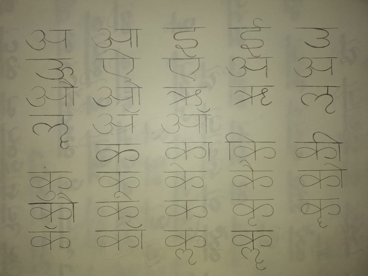
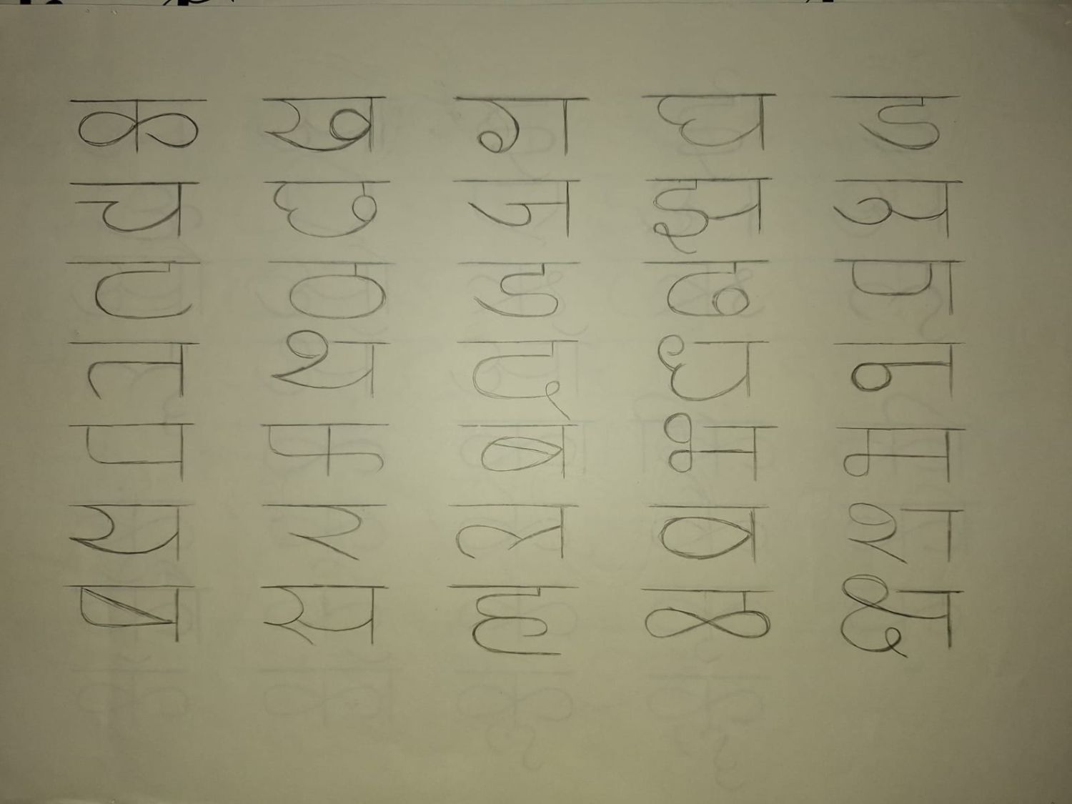
The Devanagari Script part 2
Building on the fundamentals, this artwork explores a wider range of Devanagari letterforms, including various matras, ligatures, and character combinations. Through continuous practice and observation, I developed a deeper understanding of the script's structure, rhythm, and versatility, creating a strong foundation for my own typographic explorations.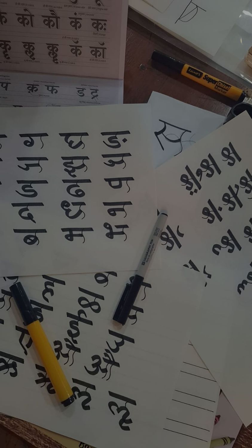
Developing My own Font- Inspired by the Devanagari Script
After gaining a thorough understanding of the Devanagari script, I began developing my own typeface inspired by its structural principles. The flowing curves and interconnected forms reflect India's cultural diversity—where countless traditions, languages, and communities coexist and blend harmoniously. Through this typeface, I sought to capture the openness, fluidity, and unity that define India's rich cultural identity while reimagining Devanagari in a contemporary visual language.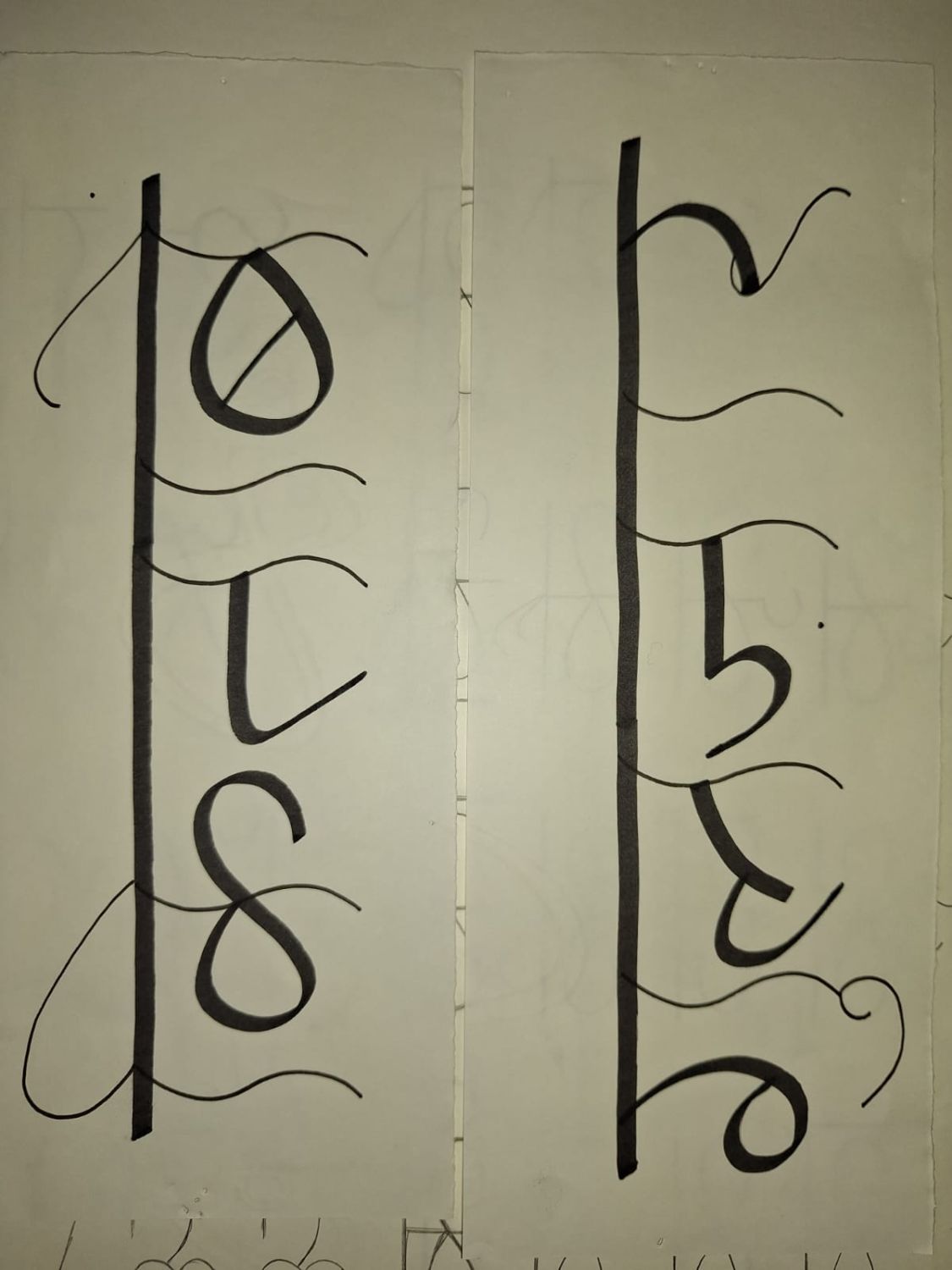
Kitabe Gulzar
This artwork presents the title of the poem rendered in my custom Devanagari-inspired typeface. Focusing on a single phrase allowed me to refine the balance, rhythm, and visual identity of the letterforms while exploring how typography can convey emotion and meaning. It served as a bridge between designing individual characters and applying the typeface to longer text.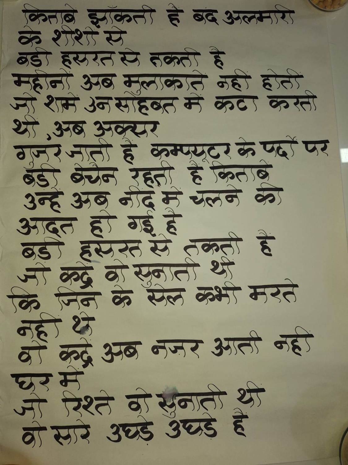
Kitaaben - Gulzar's famous poem about books, simply titled "Kitaaben" (किताबें), reflects on how physical books are slowly being replaced by digital screens and how this changes our connection to reading.
Extending the exploration further, this artwork features the complete poem composed using my custom Devanagari-inspired typeface. I chose Gulzar’s celebrated poem “Kitaaben” (किताबें), which reflects on how physical books are gradually being replaced by digital screens and how this shift changes our relationship with reading. Setting the poem in my typeface allowed me to test the consistency, readability, and flow of the design across an extended body of text. By bringing together poetry and typography, I aimed to create a cohesive visual experience that not only demonstrates the functionality of the typeface, but also echoes the poem’s nostalgic reflection on memory, touch, and the enduring emotional connection we share with books.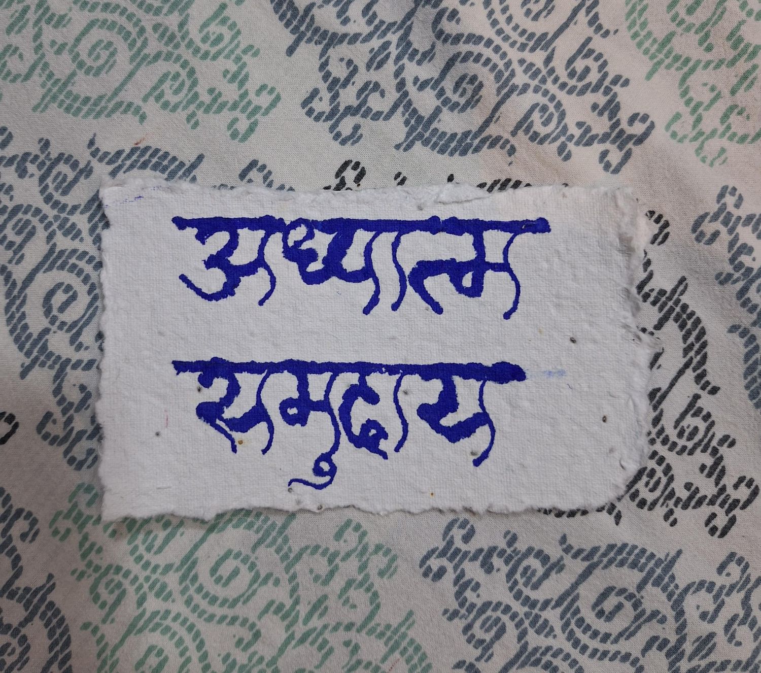
India from my Perspective - Adhyatma and Samudaya
Having developed my typeface, I wanted to explore how typography could communicate not just language, but identity. I selected a series of words that embody the essence of India—its values, traditions, and collective spirit. Each word represents a facet of the country's cultural fabric, allowing the typeface to become a visual expression of ideas that have shaped Indian society for generations. Through this series, the letterforms move beyond aesthetics to convey meaning, emotion, and cultural significance.This artwork brings together two fundamental values that define Indian culture: Adhyatma (Spirituality) and Samudaya (Community). While Adhyatma reflects India's enduring pursuit of inner growth, self-awareness, and spiritual harmony, Samudaya represents the collective spirit, unity, and interconnectedness that bind its diverse communities together. Rendered in my custom typeface, these words celebrate the balance between individual reflection and collective belonging—qualities that continue to shape India's cultural identity.
India from my Perspective - Utsav and Prakriti
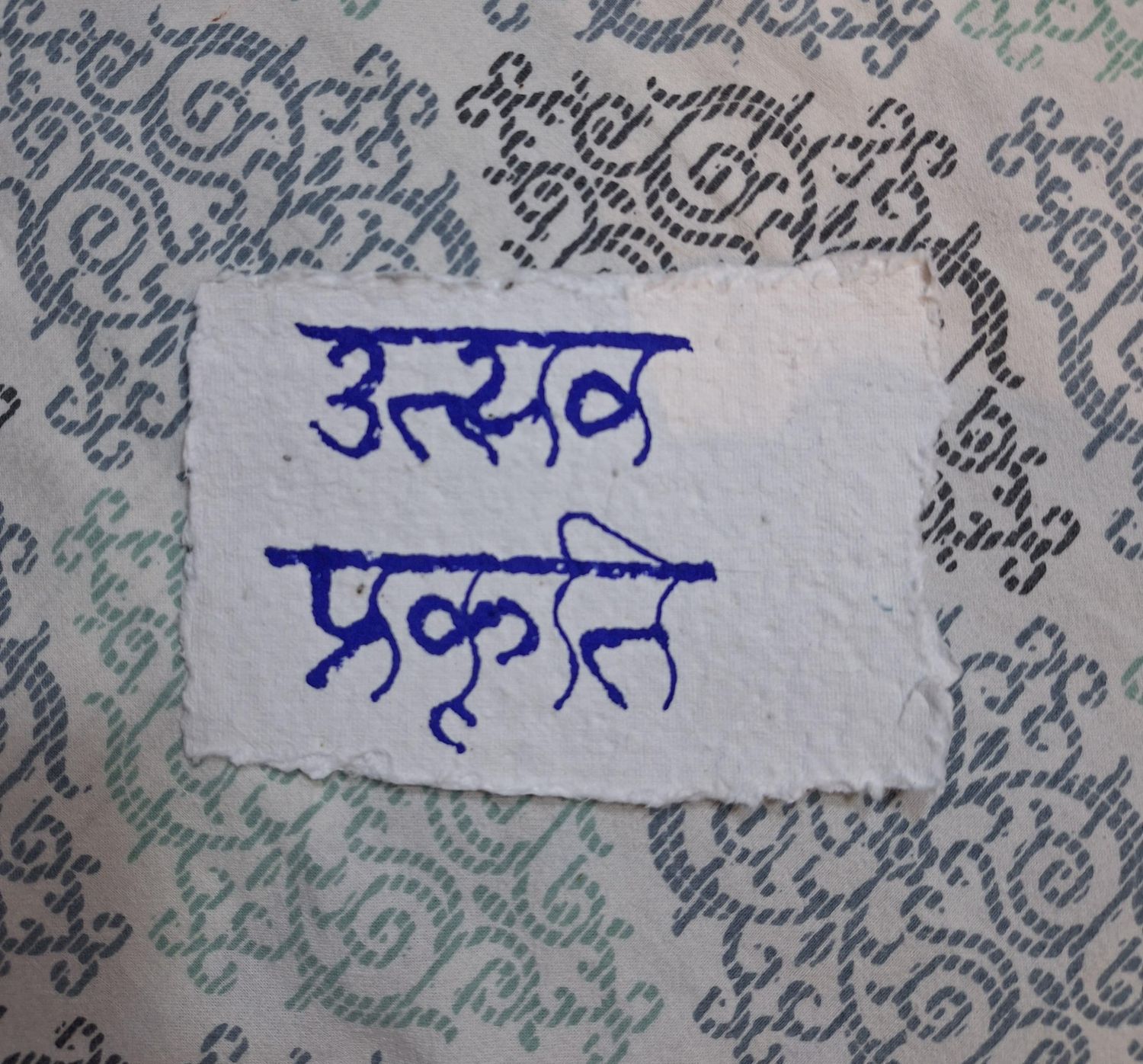
This artwork explores two values that are deeply rooted in India's way of life: Utsav - उत्सव (Celebration) and Prakriti - प्रकृति (Nature). Utsav reflects India's vibrant spirit of coming together through festivals, rituals, and shared traditions that strengthen social bonds across diverse communities. Prakriti represents the profound respect for nature that is embedded in Indian philosophy, where the environment is viewed not merely as a resource but as an integral part of life and existence. Through my custom typeface, these words celebrate the harmony between joyful cultural expression and the deep reverence for the natural world, both of which continue to shape India's identity.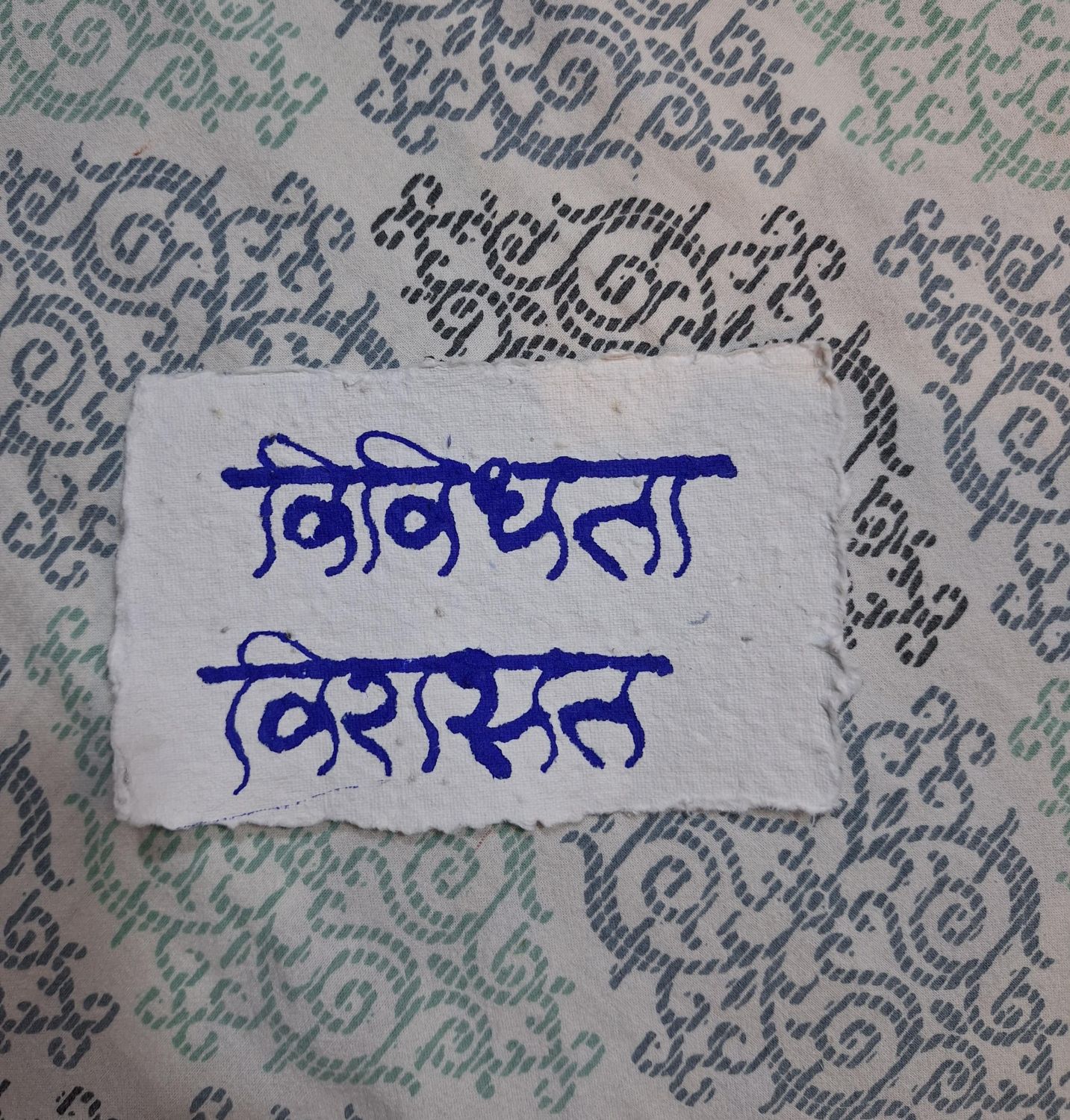
India from my Perspective - Vividhatā and Virāsat
This artwork celebrates two defining pillars of India's identity: Vividhata - विविधता (Diversity) and Virasat -विरासत (Heritage). Vividhata reflects the country's remarkable coexistence of languages, religions, traditions, and cultures, demonstrating how differences come together to form a unified national identity. Virasat represents the rich legacy passed down through generations-its art, architecture, literature, customs, and values that continue to shape contemporary India. Through my custom typeface, these words express the interconnectedness of India's diverse communities and the enduring heritage that preserves its cultural richness while inspiring future generations.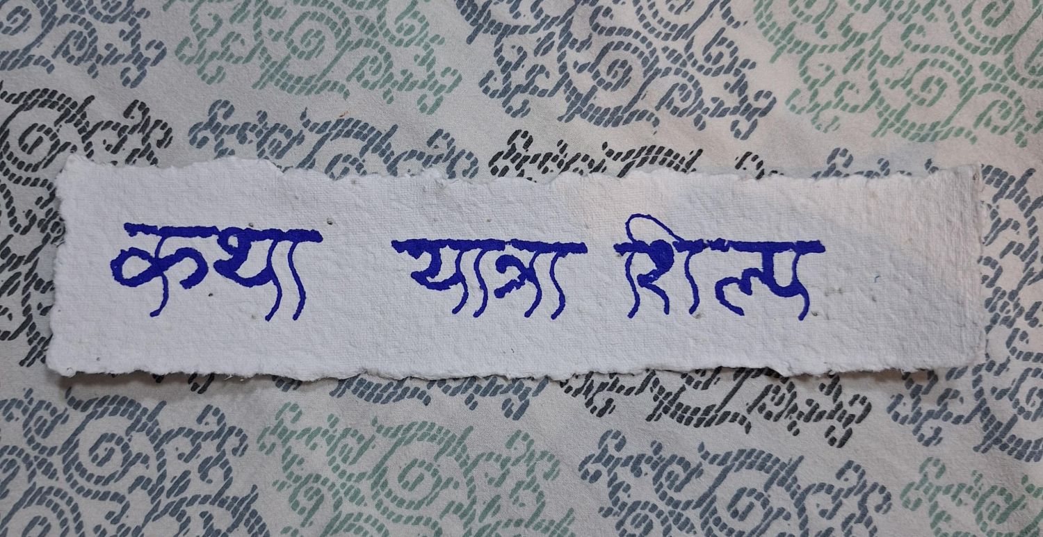
India from my Perspective - Katha, Yatra and Shilp
This artwork brings together three words that reflect the essence of India's cultural and creative spirit: Katha - कथा (Story), Yatra - यात्रा (Journey), and Shilp - शिल्प (Craft). Katha represents India's rich tradition of storytelling, where history, mythology, and lived experiences are passed down through generations. Yatra symbolizes both physical and spiritual journeys, reflecting a lifelong pursuit of discovery, growth, and purpose. Shilp celebrates the craftsmanship and artisanal heritage that have shaped India's artistic identity for centuries. Together, these words embody the narratives, experiences, and skilled traditions that continue to define India's cultural landscape. Rendered in my custom typeface, they demonstrate how typography can preserve and communicate the values and stories that form the foundation of Indian heritage.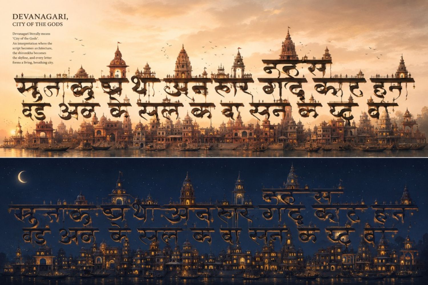
Devanagari- The City of Gods
This artwork represents the culmination of my exploration into Devanagari typography, demonstrating the scope and possibilities of my custom typeface beyond conventional text. Inspired by the literal meaning of Devanagari—"City of the Gods"—I reimagined each letterform as an architectural element, where temples, domes, and traditional Indian structures emerge seamlessly from the script itself. The cityscape becomes an extension of the letterforms, blurring the boundaries between language, architecture, and culture.More than a typeface, this artwork presents typography as a medium for storytelling and visual expression. It illustrates how letterforms can evolve into immersive environments while preserving their cultural roots. By transforming my typeface into a living city, I envision the broader applications of the design across exhibitions, publications, environmental graphics, branding, and cultural experiences, highlighting the endless creative possibilities of Devanagari as both a script and an art form.